
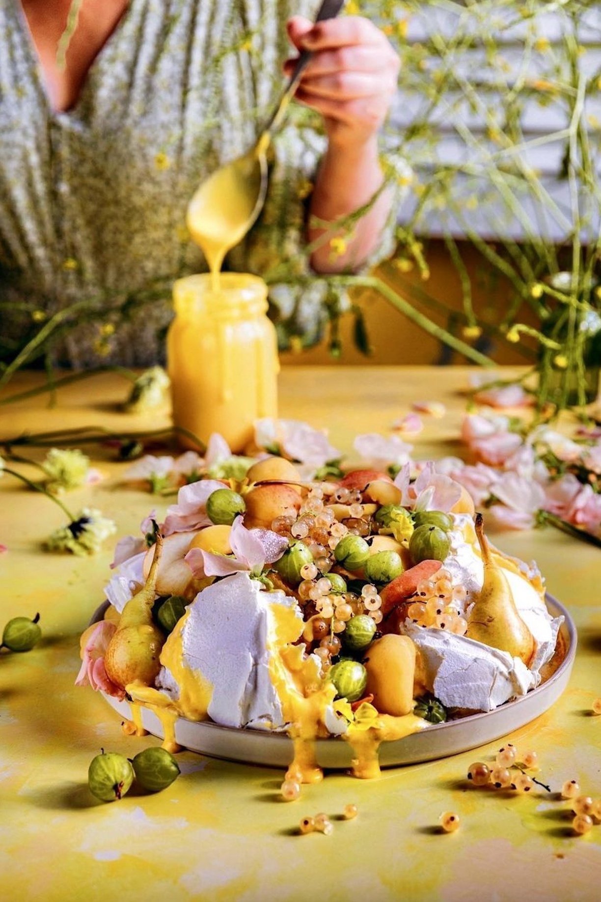
Making millennials shake in their boots is this quintessentially spring-like beauty of buttery yellow.
I look at our grey sofas, slowly being hidden by pastel accent pillows and fluffy throws and admit that we fell into the colourless trap a few years ago.
But fear not!
Apartment Therapy bowed to butterness calling it the ‘IT’ colour for interiors in 2024 and slowly we see the interiors trends filtering down, in as rhythmic a pattern as Selena and Benny’s new bluest flame banger.
I bleat on about the flow from paint to food, from couture fashion catwalks to beauty and product styling briefs. Often up to 18 months ahead, the US wedding trends will dominate couple’s colour palettes here in the UK and across Europe the following year. And all of these influences are a melting pot for me.
To pour over research into consumer forecasts, supermarket predictions for the next big food to fill your TikTok feeds. I piece together how I see the world fusions of interiors, fashion and food into new backdrop designs and hopefully make you think twice.
Once for what’s missing from your collections and twice for what you have never tried. We can all have firm favourites but there come’s a point where cutting edge becomes cutting room floor. Remember you are captivating both your client’s and your audience. The people consuming your content creation.
Same backdrop - multiple competitive clients? It’s borrowed time before the work becomes less unique to them and more generic to you. I went to Athens to help you change that.

Lucy on location in Athens, February 2025
Nostalgic yellow is back in style.
With searches are up with a staggering 115% for butter yellow inspiration, it’s no wonder this welcoming but whimsical hue is one of the hotly predicted Pinterest colour trends of this year.
More on the others to come. This blog is dedicated to the the salted and unsalted.

Source : The 2025 Pinterest Palette: This year’s trending colours.

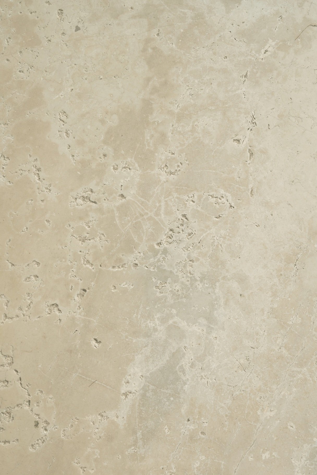
The softest creamy yellowy butter tone, with a very subtle painted texture.
Solid colour with a twist.
From an original painting shot by Lucy.
Launch date: 25 Feb 2025.
Stunningly shot feeling light and creamy by Alicja Sieronski.
1:1 scale. 100 megapixel - high definition print.
Sizes & Prices
Double XL 90cm by 134cm — £59.95 (£71.94 inc. VAT in UK)
Standard tabletop size 60 x 90cm — £27.50 (£33 inc. VAT in UK)
Half size 40 x 60cm — £16.50 (£19.80 inc. VAT in UK)
Quarter size 30 x 45cm — £10.50 (£12.60 inc. VAT in UK)
UK VAT Tax
20% VAT will be added at checkout for UK orders.
Custom Sizes
This design is available in a variety of larger sizes as a Custom Listing for you.
Studio XXL 134cm by 193cm — £79.95 (£95.94 inc. VAT in UK)
Please email mama@capturebylucy.com
Material Care
Printed on the highest quality lay flat PET material exclusive to CBL in the UK.
A grey block out material for professional and studio photography with no visible texture in the vinyl.
Love it and it will last forever.
Read all Lucy’s tips and FAQs here.
Product Safety Information GSPR
These backdrops are designed for photographic use.
Both the material and ink specification and safety testing are available on request.
GPSR - EU Responsible Person (for authorities only) eucomply OÜ
Pärnu mnt 139b-14
11317 Tallinn, Estonia hello@eucompliancepartner.comwww.eucompliancepartner.com
Regulatory Compliance
We ensure all our products comply with GPSR, CE marking, and other applicable EU Directives.
A stunning swirling cream marble stone captured by Lucy in Athens, Greece in February 2025.
Get ahead of the ancient civilisation, goddess core trend predicted by Pinterest for this year.
The one you didn't know you needed in your warm neutral collection.
Stunningly shot feeling a summer warmth by Alicja Sieronski.
Launch date: 25 February 2025
1:1 scale. 100 megapixel - high definition print.
Sizes & Prices
XL 90cm by 134cm — £59.95 (£71.94 inc. VAT in the UK ONLY)
Standard tabletop size 60 x 90cm — £27.50 (£33 inc. VAT in UK)
Half size 40 x 60cm — £16.50 (£19.80 inc. VAT in UK)
Quarter size 30 x 45cm — £10.50 (£12.60 inc. VAT in UK)
UK VAT Tax
20% VAT will be added at checkout for UK orders.
Custom Sizes
This design is available in a variety of larger sizes as a Custom Listing for you.
Studio XXL 134cm by 193cm — £79.95 (£95.94 inc. VAT in UK)
Please email mama@capturebylucy.com
Material Care
Printed on the highest quality lay flat PET material exclusive to CBL in the UK.
A grey block out material for professional and studio photography with no visible texture in the vinyl.
Love it and it will last forever.
Read all Lucy’s tips and FAQs here.
Product Safety Information GSPR
These backdrops are designed for photographic use.
Both the material and ink specification and safety testing are available on request.
GPSR - EU Responsible Person (for authorities only) eucomply OÜ
Pärnu mnt 139b-14
11317 Tallinn, Estonia hello@eucompliancepartner.comwww.eucompliancepartner.com
Regulatory Compliance
We ensure all our products comply with GPSR, CE marking, and other applicable EU Directives.

A tile backdrop with a clean but real finish. Shot by Lucy in Porto in 2021.
AVAILABLE IN OUR MULTI-OPTION STORE IN A VARIETY OF COLOURS.
1:1 scale. 100 megapixel - high definition print.
Sizes & Prices
Standard tabletop size 60 x 90cm — £27.50 (£33 inc. VAT in UK)
Half size 40 x 60cm — £16.50 (£19.80 inc. VAT in UK)
Quarter size 30 x 45cm — £10.50 (£12.60 inc. VAT in UK)
UK VAT Tax
20% VAT will be added at checkout for UK orders.
Custom Sizes
This design is available in a variety of larger sizes as a Custom Listing for you.
Double XL 90cm by 134cm — £59.95 (£71.94 inc. VAT in UK)
Studio XXL 134cm by 193cm — £79.95 (£95.94 inc. VAT in UK)
Please email mama@capturebylucy.com
Material Care
Printed on the highest quality lay flat PET material exclusive to CBL in the UK.
A grey block out material for professional and studio photography with no visible texture in the vinyl.
Love it and it will last forever.
Read all Lucy’s tips and FAQs here.
Product Safety Information GSPR
These backdrops are designed for photographic use.
Both the material and ink specification and safety testing are available on request.
GPSR - EU Responsible Person (for authorities only) eucomply OÜ
Pärnu mnt 139b-14
11317 Tallinn, Estonia hello@eucompliancepartner.comwww.eucompliancepartner.com
Regulatory Compliance
We ensure all our products comply with GPSR, CE marking, and other applicable EU Directives.

A buttery cream wall bathed in rich late winter Greek sunshine in Athens. Shot by Lucy in February 2025.
Use as a wall or table surface and forget the faff of shadow casters.
Place your subjects among the real shadows of the European light and shade.
Launch date: 25 Feb 2025
1:1 scale. 100 megapixel - high definition print.
Sizes & Prices
Double XL 90cm by 134cm — £59.95 (£71.94 inc. VAT in UK)
Standard tabletop size 60 x 90cm — £27.50 (£33 inc. VAT in UK)
Half size 40 x 60cm — £16.50 (£19.80 inc. VAT in UK)
Quarter size 30 x 45cm — £10.50 (£12.60 inc. VAT in UK)
UK VAT Tax
20% VAT will be added at checkout for UK orders.
Custom Sizes
This design is available in a variety of larger sizes as a Custom Listing for you.
Studio XXL 134cm by 193cm — £79.95 (£95.94 inc. VAT in UK)
Please email mama@capturebylucy.com
Material Care
Printed on the highest quality lay flat PET material exclusive to CBL in the UK.
A grey block out material for professional and studio photography with no visible texture in the vinyl.
Love it and it will last forever.
Read all Lucy’s tips and FAQs here.
Product Safety Information GSPR
These backdrops are designed for photographic use.
Both the material and ink specification and safety testing are available on request.
GPSR - EU Responsible Person (for authorities only) eucomply OÜ
Pärnu mnt 139b-14
11317 Tallinn, Estonia hello@eucompliancepartner.comwww.eucompliancepartner.com
Regulatory Compliance
We ensure all our products comply with GPSR, CE marking, and other applicable EU Directives.
A real wall Lucy shot in Seville in February 2024. The sun shone down on a painted rendered wall opposite the river and cast moving shadows against the flora and fauna outside the shop front.
Transport your imagery to holiday mode. An outdoor backdrop for indoor shooting!
Shot overhead with stunning contrast by Alicja Sieronski.
1: 1 scale. 100 megapixel - high definition print.
Sizes & Prices
Double XL 90cm by 134cm — £59.95 (£71.94 inc. VAT in UK)
Standard tabletop size 60 x 90cm — £27.50 (£33 inc. VAT in UK)
Half size 40 x 60cm — £16.50 (£19.80 inc. VAT in UK)
Quarter size 30 x 45cm — £10.50 (£12.60 inc. VAT in UK)
UK VAT Tax
20% VAT will be added at checkout for UK orders.
Custom Sizes
This design is available in a variety of larger sizes as a Custom Listing for you.
Studio XXL 134cm by 193cm — £79.95 (£95.94 inc. VAT in UK)
Please email mama@capturebylucy.com
Material Care
Printed on the highest quality lay flat PET material exclusive to CBL in the UK.
A grey block out material for professional and studio photography with no visible texture in the vinyl.
Love it and it will last forever.
Read all Lucy’s tips and FAQs here.
Product Safety Information GSPR
These backdrops are designed for photographic use.
Both the material and ink specification and safety testing are available on request.
GPSR - EU Responsible Person (for authorities only) eucomply OÜ
Pärnu mnt 139b-14
11317 Tallinn, Estonia hello@eucompliancepartner.comwww.eucompliancepartner.com
Regulatory Compliance
We ensure all our products comply with GPSR, CE marking, and other applicable EU Directives.
A hand painted pale lemon tone backdrop.
Created from an original piece of artwork with the vibrance stripped back for a gentle hazy sunshine hue.
AVAILABLE IN OUR MULTI-OPTION STORE IN A VARIETY OF COLOURS.
1:1 scale. 100 megapixel - high definition print.
Sizes & Prices
Standard tabletop size 60 x 90cm — £27.50 (£33 inc. VAT in UK)
Half size 40 x 60cm — £16.50 (£19.80 inc. VAT in UK)
Quarter size 30 x 45cm — £10.50 (£12.60 inc. VAT in UK)
UK VAT Tax
20% VAT will be added at checkout for UK orders.
Custom Sizes
This design is available in a variety of larger sizes as a Custom Listing for you.
Double XL 90cm by 134cm — £59.95 (£71.94 inc. VAT in UK)
Studio XXL 134cm by 193cm — £79.95 (£95.94 inc. VAT in UK)
Please email mama@capturebylucy.com
Material Care
Printed on the highest quality lay flat PET material exclusive to CBL in the UK.
A grey block out material for professional and studio photography with no visible texture in the vinyl.
Read all Lucy’s tips and FAQs here.
Love it and it will last forever.
Product Safety Information GSPR
These backdrops are designed for photographic use.
Both the material and ink specification and safety testing are available on request.
GPSR - EU Responsible Person (for authorities only) eucomply OÜ
Pärnu mnt 139b-14
11317 Tallinn, Estonia hello@eucompliancepartner.comwww.eucompliancepartner.com
Regulatory Compliance
We ensure all our products comply with GPSR, CE marking, and other applicable EU Directives.
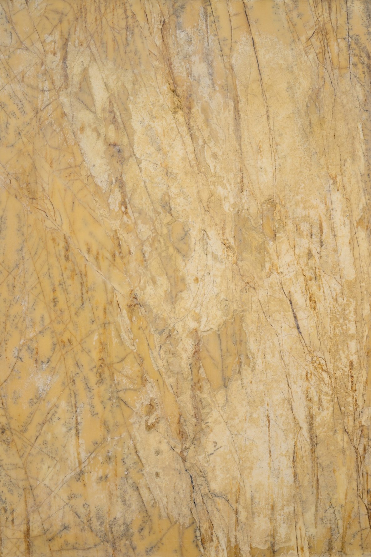
A stunning stone backdrop shot by Lucy in Athens in February 2025.
A creamy yellowy undertone with gravitas and spot on for taking inspiration from the Kitchen Aid Colour of the Year 25 - Butter.
Stunningly shot feeling dreamy by Alicja Sieronski.
1:1 scale. 100 megapixel - high definition print.
Launch date: 25 Feb 2025
Sizes & Prices
XL 90cm by 134cm — £59.95 (£71.94 inc. VAT in the UK ONLY)
Standard tabletop size 60 x 90cm — £27.50 (£33 inc. VAT in UK)
Half size 40 x 60cm — £16.50 (£19.80 inc. VAT in UK)
Quarter size 30 x 45cm — £10.50 (£12.60 inc. VAT in UK)
UK VAT Tax
20% VAT will be added at checkout for UK orders.
Custom Sizes
This design is available in a variety of larger sizes as a Custom Listing for you.
Studio XXL 134cm by 193cm — £79.95 (£95.94 inc. VAT in UK)
Please email mama@capturebylucy.com
Material Care
Printed on the highest quality lay flat PET material exclusive to CBL in the UK.
A grey block out material for professional and studio photography with no visible texture in the vinyl.
Love it and it will last forever.
Read all Lucy’s tips and FAQs here.
Product Safety Information GSPR
These backdrops are designed for photographic use.
Both the material and ink specification and safety testing are available on request.
GPSR - EU Responsible Person (for authorities only) eucomply OÜ
Pärnu mnt 139b-14
11317 Tallinn, Estonia hello@eucompliancepartner.comwww.eucompliancepartner.com
Regulatory Compliance
We ensure all our products comply with GPSR, CE marking, and other applicable EU Directives.

Luxe and glamour from Ancient Greece.
A grey toned marble stone Lucy shot in Athens with a hint of rosey copper veining. Shoot it cool for a pinker viewing or warm for a golden hue.
A remarkable addition for these elevated aspirational shots.
1:1 scale. 100 megapixel - high definition print.
Sizes & Prices
Standard tabletop size 60 x 90cm — £27.50 (£33 inc. VAT in UK)
Half size 40 x 60cm — £16.50 (£19.80 inc. VAT in UK)
Quarter size 30 x 45cm — £10.50 (£12.60 inc. VAT in UK)
UK VAT Tax
20% VAT will be added at checkout for UK orders.
Custom Sizes
This design is available in a variety of larger sizes as a Custom Listing for you.
Double XL 90cm by 134cm — £59.95 (£71.94 inc. VAT in UK)
Studio XXL 134cm by 193cm — £79.95 (£95.94 inc. VAT in UK)
Please email mama@capturebylucy.com
Material Care
Printed on the highest quality lay flat PET material exclusive to CBL in the UK.
A grey block out material for professional and studio photography with no visible texture in the vinyl.
Love it and it will last forever.
Read all Lucy’s tips and FAQs here.
Product Safety Information GSPR
These backdrops are designed for photographic use.
Both the material and ink specification and safety testing are available on request.
GPSR - EU Responsible Person (for authorities only) eucomply OÜ
Pärnu mnt 139b-14
11317 Tallinn, Estonia hello@eucompliancepartner.comwww.eucompliancepartner.com
Regulatory Compliance
We ensure all our products comply with GPSR, CE marking, and other applicable EU Directives.
A blonder more sand toned version of the Venetian stone Lucy stumbled upon in September 2021. The detail needs to be seen to be believed.
As seen in the Pasta Evangelists’ counter at the M&S Food Hall Kensington.
1:1 scale. 100 megapixel - high definition print.
Sizes & Prices
Standard tabletop size 60 x 90cm — £27.50 (£33 inc. VAT in UK)
Half size 40 x 60cm — £16.50 (£19.80 inc. VAT in UK)
Quarter size 30 x 45cm — £10.50 (£12.60 inc. VAT in UK)
UK VAT Tax
20% VAT will be added at checkout for UK orders.
Custom Sizes
This design is available in a variety of larger sizes as a Custom Listing for you.
Double XL 90cm by 134cm — £59.95 (£71.94 inc. VAT in UK)
Studio XXL 134cm by 193cm — £79.95 (£95.94 inc. VAT in UK)
Please email mama@capturebylucy.com
Material Care
Printed on the highest quality lay flat PET material exclusive to CBL in the UK.
A grey block out material for professional and studio photography with no visible texture in the vinyl.
Love it and it will last forever.
Read all Lucy’s tips and FAQs here.
Product Safety Information GSPR
These backdrops are designed for photographic use.
Both the material and ink specification and safety testing are available on request.
GPSR - EU Responsible Person (for authorities only) eucomply OÜ
Pärnu mnt 139b-14
11317 Tallinn, Estonia hello@eucompliancepartner.comwww.eucompliancepartner.com
Regulatory Compliance
We ensure all our products comply with GPSR, CE marking, and other applicable EU Directives.
KitchenAid were hot on their heels and you guessed it…

Kitchen Aid Colour of the Year 2025.
From mellow to majestic now is the time to add a textured sunshine backdrop to your collection.
The difference with a gentle texture is an immediate sense of depth and elevation. Solids work for striking colour pop creative vision but when shooting more aspirational content - it will fall flat. Pun intended.
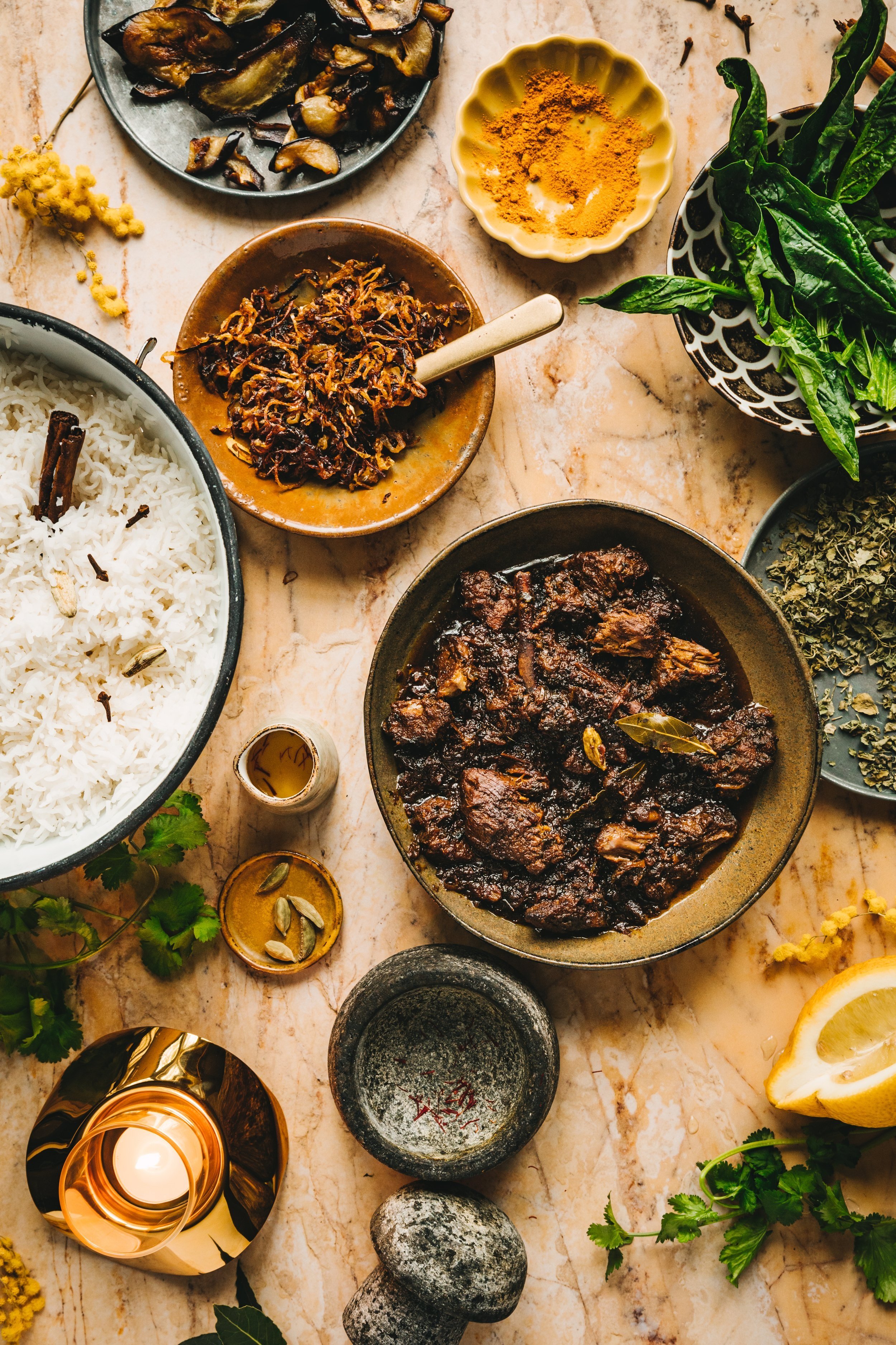
You see the example of this almost every Christmas. The higher end supermarkets and more luxury food halls try to sell yes their festive feasts on an array of stones, marbles and metals, whereas the budget end is more often than not shot on a solid flat colour, with foil curling in leu of a silk ribbon in the background. It absolutely fits the branding but if you are trying to create a sense of value, adding even a hint of architectural detail in a plaster or painted surface will do the trick.
The wearable with any skin tone hue manages to tally comfort with corporate when needs be. Leaning into both the traditional country colour-next-door aesthetic as well as a those giving quiet luxury. When it comes to food photography trends for 2025, we will see these tones lingering long after the Easter bunny has hopped off.
This soft yellow is known for stimulating the appetite, a positive but not overbearing shade, it allows the background to be more understated.

A warm yellow hue stone backdrop.
Tonally the original colour tone of this plaster wall, stripped of its layers of render Lucy shot in 2021.
Stunningly shot by Alicja Sieronski.
1: 1 scale. 100 megapixel - high definition print.
Sizes & Prices
Double XL 90cm by 134cm — £59.95 (£71.94 inc. VAT in UK)
Standard tabletop size 60 x 90cm — £27.50 (£33 inc. VAT in UK)
Half size 40 x 60cm — £16.50 (£19.80 inc. VAT in UK)
Quarter size 30 x 45cm — £10.50 (£12.60 inc. VAT in UK)
UK VAT Tax
20% VAT will be added at checkout for UK orders.
Custom Sizes
This design is available in a variety of larger sizes as a Custom Listing for you.
Studio XXL 134cm by 193cm — £79.95 (£95.94 inc. VAT in UK)
Please email mama@capturebylucy.com
Material Care
Printed on the highest quality lay flat PET material exclusive to CBL in the UK.
A grey block out material for professional and studio photography with no visible texture in the vinyl.
Love it and it will last forever.
Read all Lucy’s tips and FAQs here.
Product Safety Information GSPR
These backdrops are designed for photographic use.
Both the material and ink specification and safety testing are available on request.
GPSR - EU Responsible Person (for authorities only) eucomply OÜ
Pärnu mnt 139b-14
11317 Tallinn, Estonia hello@eucompliancepartner.comwww.eucompliancepartner.com
Regulatory Compliance
We ensure all our products comply with GPSR, CE marking, and other applicable EU Directives.
A hand painted yellow toned backdrop design.
Originally inspired by a hot summer day in the buttercup field behind Lucy’s garden where her pet pigs Isabel and Jemima mooch and graze, oinking out into the Somerset countryside. Created during the heat wave over England in June 2022.
Stunningly shot by Alicja Sieronski.
AVAILABLE IN OUR MULTI-OPTION STORE IN A VARIETY OF COLOURS.
1:1 scale. 100 megapixel - high definition print.
Sizes & Prices
Double XL 90cm by 134cm — £59.95 (£71.94 inc. VAT in UK)
Standard tabletop size 60 x 90cm — £27.50 (£33 inc. VAT in UK)
Half size 40 x 60cm — £16.50 (£19.80 inc. VAT in UK)
Quarter size 30 x 45cm — £10.50 (£12.60 inc. VAT in UK)
UK VAT Tax
20% VAT will be added at checkout for UK orders.
Custom Sizes
This design is available in a variety of larger sizes as a Custom Listing for you.
Studio XXL 134cm by 193cm — £79.95 (£95.94 inc. VAT in UK)
Please email mama@capturebylucy.com
Material Care
Printed on the highest quality lay flat PET material exclusive to CBL in the UK.
A grey block out material for professional and studio photography with no visible texture in the vinyl.
Love it and it will last forever.
Read all Lucy’s tips and FAQs here.
Product Safety Information GSPR
These backdrops are designed for photographic use.
Both the material and ink specification and safety testing are available on request.
GPSR - EU Responsible Person (for authorities only) eucomply OÜ
Pärnu mnt 139b-14
11317 Tallinn, Estonia hello@eucompliancepartner.comwww.eucompliancepartner.com
Regulatory Compliance
We ensure all our products comply with GPSR, CE marking, and other applicable EU Directives.

A spray graffiti paint wall captured by Lucy in Venice Beach in LA in April 2023.
Urban with full on colour impact!
AVAILABLE IN OUR MULTI-OPTION STORE IN A VARIETY OF COLOURS.
1:1 scale. 100 megapixel - high definition print.
Sizes & Prices
Standard tabletop size 60 x 90cm — £27.50 (£33 inc. VAT in UK)
Half size 40 x 60cm — £16.50 (£19.80 inc. VAT in UK)
Quarter size 30 x 45cm — £10.50 (£12.60 inc. VAT in UK)
UK VAT Tax
20% VAT will be added at checkout for UK orders.
Custom Sizes
This design is available in a variety of larger sizes as a Custom Listing for you.
Double XL 90cm by 134cm — £59.95 (£71.94 inc. VAT in UK)
Studio XXL 134cm by 193cm — £79.95 (£95.94 inc. VAT in UK)
Please email mama@capturebylucy.com
Material Care
Printed on the highest quality lay flat PET material exclusive to CBL in the UK.
A grey block out material for professional and studio photography with no visible texture in the vinyl.
Love it and it will last forever.
Read all Lucy’s tips and FAQs here.
Product Safety Information GSPR
These backdrops are designed for photographic use.
Both the material and ink specification and safety testing are available on request.
GPSR - EU Responsible Person (for authorities only) eucomply OÜ
Pärnu mnt 139b-14
11317 Tallinn, Estonia hello@eucompliancepartner.comwww.eucompliancepartner.com
Regulatory Compliance
We ensure all our products comply with GPSR, CE marking, and other applicable EU Directives.

A vintage piece of linen in a classic gingham check, found and shot by Lucy in Dorset.
Pastel colour for Spring scenes and if you love the texture but need those summer picnic puncher tones, head to the Picnic Gingham range of colours, in an ever so slightly larger scale.
AVAILABLE IN OUR MULTI-OPTION STORE IN A VARIETY OF COLOURS.
1:1 scale. 100 megapixel - high definition print.
Sizes & Prices
Standard tabletop size 60 x 90cm — £27.50 (£33 inc. VAT in UK)
Half size 40 x 60cm — £16.50 (£19.80 inc. VAT in UK)
Quarter size 30 x 45cm — £10.50 (£12.60 inc. VAT in UK)
UK VAT Tax
20% VAT will be added at checkout for UK orders.
Custom Sizes
This design is available in a variety of larger sizes as a Custom Listing for you.
Double XL 90cm by 134cm — £59.95 (£71.94 inc. VAT in UK)
Studio XXL 134cm by 193cm — £79.95 (£95.94 inc. VAT in UK)
Please email mama@capturebylucy.com
Material Care
Printed on the highest quality lay flat PET material exclusive to CBL in the UK.
A grey block out material for professional and studio photography with no visible texture in the vinyl.
Love it and it will last forever.
Read all Lucy’s tips and FAQs here.
Product Safety Information GSPR
These backdrops are designed for photographic use.
Both the material and ink specification and safety testing are available on request.
GPSR - EU Responsible Person (for authorities only) eucomply OÜ
Pärnu mnt 139b-14
11317 Tallinn, Estonia hello@eucompliancepartner.comwww.eucompliancepartner.com
Regulatory Compliance
We ensure all our products comply with GPSR, CE marking, and other applicable EU Directives.
A yellow marble Lucy shot in Seville in February 2024. Golden yellow hues, intricate veining and more intrigue than the golden Italian or Latte Marble designs.
Stunningly shot by Alicja Sieronski.
1: 1 scale. 100 megapixel - high definition print.
Sizes & Prices
Double XL 90cm by 134cm — £59.95 (£71.94 inc. VAT in UK)
Standard tabletop size 60 x 90cm — £27.50 (£33 inc. VAT in UK)
Half size 40 x 60cm — £16.50 (£19.80 inc. VAT in UK)
Quarter size 30 x 45cm — £10.50 (£12.60 inc. VAT in UK)
UK VAT Tax
20% VAT will be added at checkout for UK orders.
Custom Sizes
This design is available in a variety of larger sizes as a Custom Listing for you.
Studio XXL 134cm by 193cm — £79.95 (£95.94 inc. VAT in UK)
Please email mama@capturebylucy.com
Material Care
Printed on the highest quality lay flat PET material exclusive to CBL in the UK.
A grey block out material for professional and studio photography with no visible texture in the vinyl.
Love it and it will last forever.
Read all Lucy’s tips and FAQs here.
Product Safety Information GSPR
These backdrops are designed for photographic use.
Both the material and ink specification and safety testing are available on request.
GPSR - EU Responsible Person (for authorities only) eucomply OÜ
Pärnu mnt 139b-14
11317 Tallinn, Estonia hello@eucompliancepartner.comwww.eucompliancepartner.com
Regulatory Compliance
We ensure all our products comply with GPSR, CE marking, and other applicable EU Directives.
A yellow square tile backdrop with pale grout lines Lucy shot in a hidden hotel in November 2022. Reimagined in a mustard golden hue from its deep red cousin.
A spiral tiled staircase leading to the most captivating roof terrace with views across the Marrakesh skyline.
Stunningly shot by Alicja Sieronski.
AVAILABLE IN OUR MULTI-OPTION STORE IN A VARIETY OF COLOURS.
1: 1 scale. 100 megapixel - high definition print.
Sizes & Prices
Double XL 90cm by 134cm — £59.95 (£71.94 inc. VAT in UK)
Standard tabletop size 60 x 90cm — £27.50 (£33 inc. VAT in UK)
Half size 40 x 60cm — £16.50 (£19.80 inc. VAT in UK)
Quarter size 30 x 45cm — £10.50 (£12.60 inc. VAT in UK)
UK VAT Tax
20% VAT will be added at checkout for UK orders.
Custom Sizes
This design is available in a variety of larger sizes as a Custom Listing for you.
Studio XXL 134cm by 193cm — £79.95 (£95.94 inc. VAT in UK)
Please email mama@capturebylucy.com
Material Care
Printed on the highest quality lay flat PET material exclusive to CBL in the UK.
A grey block out material for professional and studio photography with no visible texture in the vinyl.
Love it and it will last forever.
Read all Lucy’s tips and FAQs here.
Product Safety Information GSPR
These backdrops are designed for photographic use.
Both the material and ink specification and safety testing are available on request.
GPSR - EU Responsible Person (for authorities only) eucomply OÜ
Pärnu mnt 139b-14
11317 Tallinn, Estonia hello@eucompliancepartner.comwww.eucompliancepartner.com
Regulatory Compliance
We ensure all our products comply with GPSR, CE marking, and other applicable EU Directives.
Before you try this colour, consider the words in the Apartment Therapy piece and designer Autumn Hachey’s pro tip. “When styling yellow, it’s crucial to understand the tone you’re working with,” she says. Some shades of yellow can skew green”.
While testing every biscuity buttery shade under the sun over the last few months, I could see how a lime undertone took it from homely and hospitable to downright horrid.
So be careful to make sure any “butter” claiming backdrops have that crucial cream undertone. Drag a screenshot into Photoshop and colour drop a section. If it sits in a murky lurky green, click away!
High Street to High Fashion and everywhere in between.
While some might have been taken aback by Timothée’s ensemble at the Oscars, those in the trend forecasting biz can see he’s streets ahead. And that’s where I want these new designs to play a part in you leading the way in your photographic circles. By being bolder, albeit with one of the most versatile shades, and 2025’s version of beige.
Primark have showcased their 3 piece option while Chanel presented to their exclusive guest list a top to toe offering for SS25 at the Grand Palais in Paris back in January.

Go search and see. Actually the comments were much more complimentary than the salty DM.
Over the last week, World Food Photography Awards shortlist has been announced and the images I have been spotting in my Instagram feed are those that have taken a chance over more tried and tested set ups. Ooh and some on our lovely backdrops too.
Good luck to the shortlist - and roll on the finals!
Swapping out your beige backdrop for a twist on the Butter trend is an opportunity to showcase your foresight. Then watch your client’s competitors try and catch up.
No idea how to incorporate a bananery beauty into your styling. Let me create a brand mood board for you.